Creating and managing an upgrade group is quite effortless with Sublium.
Follow this step-by-step process to create a subscription upgrade group:
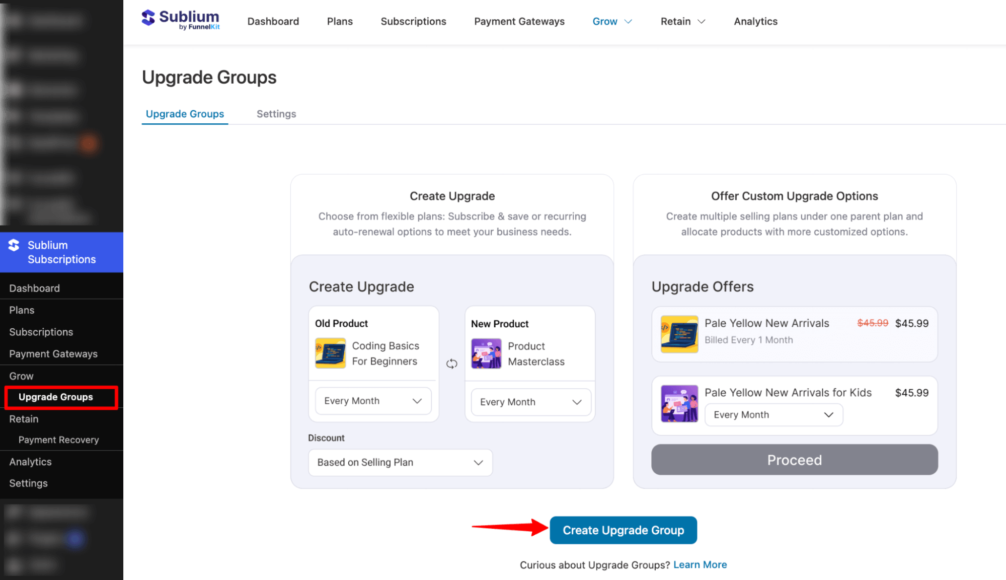
Step 1: Create an Upgrade Group
Navigate to the Sublium Subscriptions ⇒ Upgrade Groups and click on click on the “Create Upgrade Group” button.
Enter the name of your upgrade and hit “Save“.
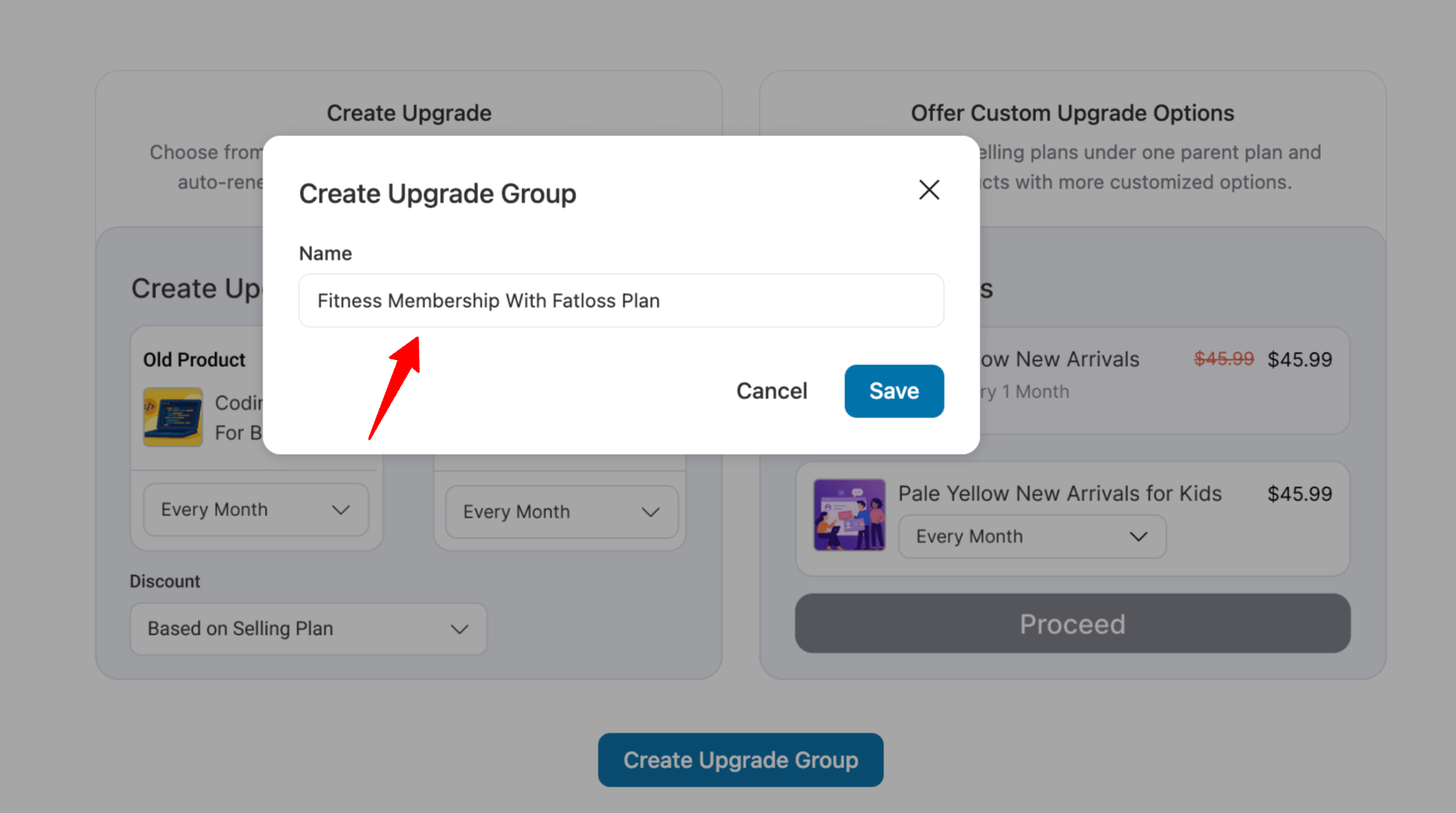
This will create your product upgrade group in Sublium.
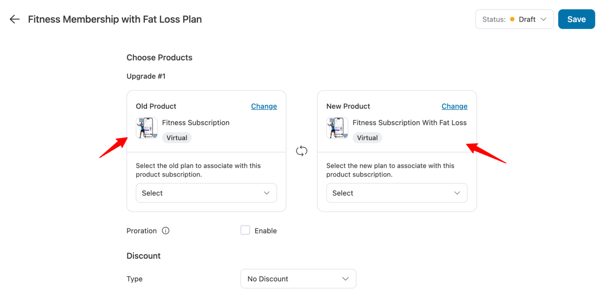
Step 2: Choose Products for Your Upgrade
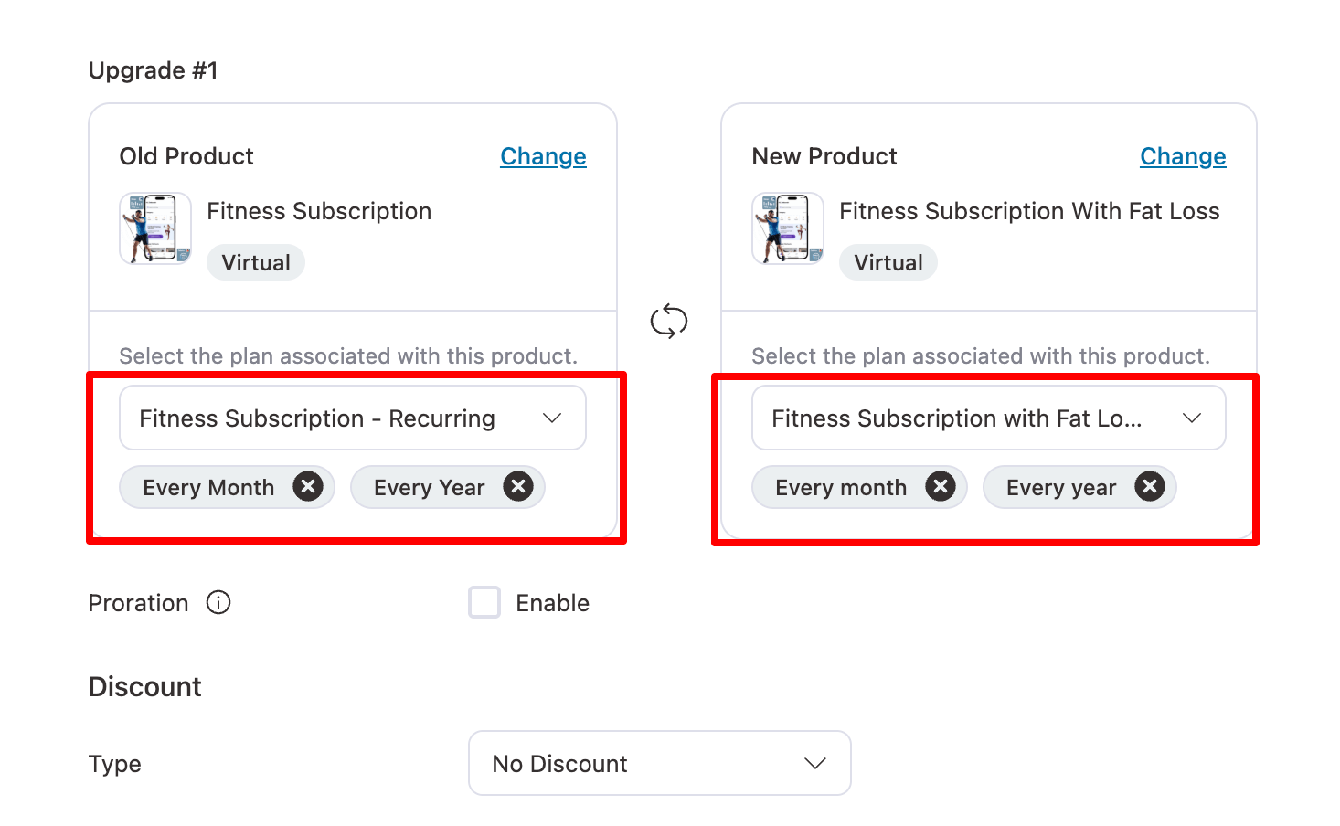
First, add the old product. Next, select the WooCommerce product that customers will transition to when they upgrade.
Step 3: Select Payment Plan for the Upgrade
Next, define the subscription payment plan associated with the upgraded product.
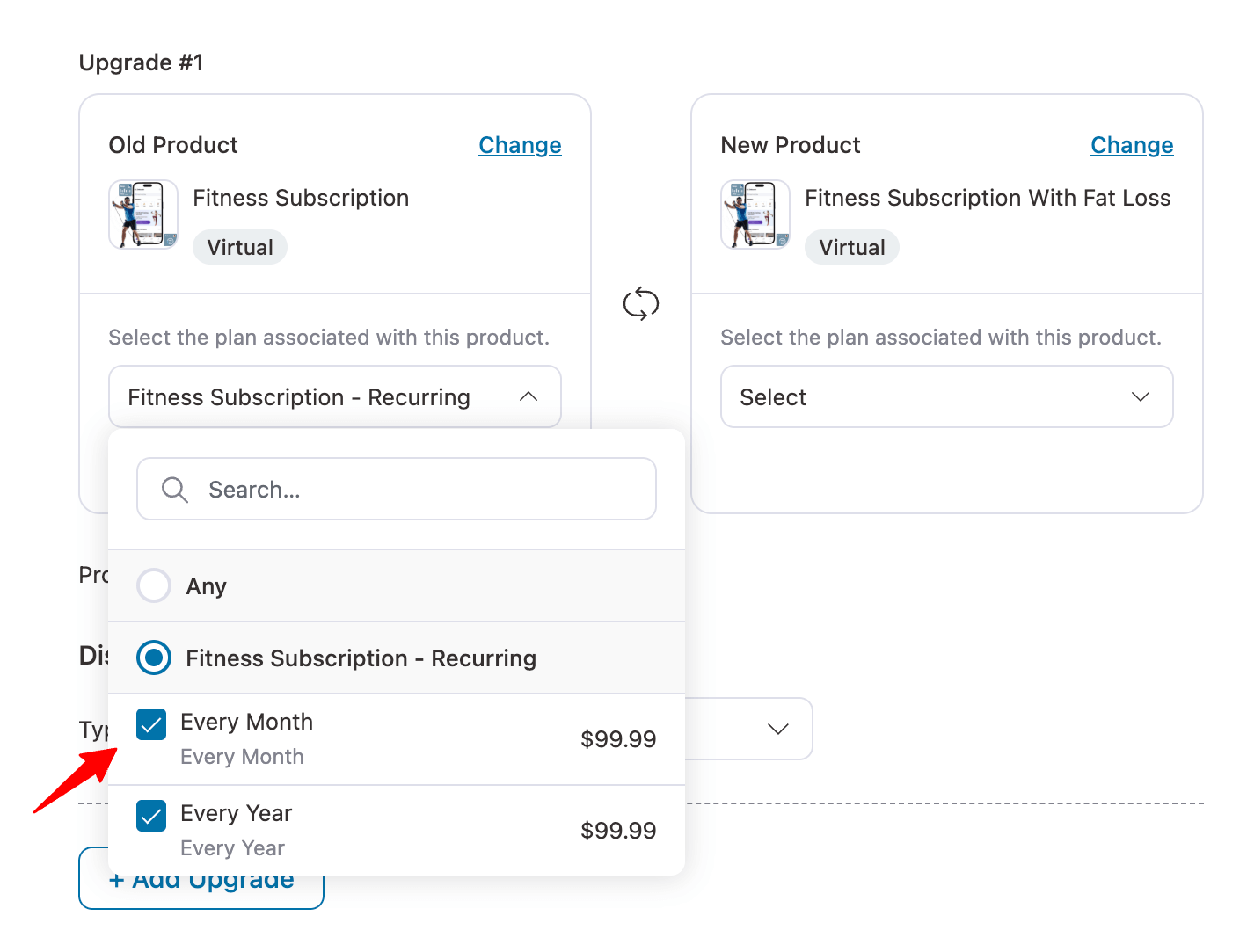
You can list multiple plans with varying billing cycles to suit different customer preferences.
Step 4: Set Proration and Discounts for the Product Upgrade
You can set proration and offer discounts during the upgrade process.
Proration
If applicable, configure proration for the upgrade.
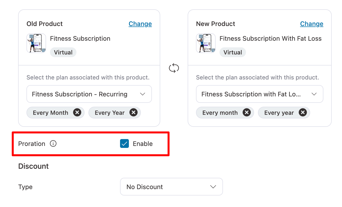
Proration in subscriptions refers to the adjustment of charges when a customer changes their subscription plan mid-billing cycle. Instead of charging them the full amount for the new plan, a prorated amount is calculated based on the time remaining in the current billing period.
For example, if a customer upgrades or downgrades their plan, the system calculates the difference for the remaining days in the billing cycle.
If they switch to a more expensive plan, they might be charged a prorated amount for the remainder of the period, and similarly, if they downgrade, they might receive a prorated refund.
It helps ensure fairness by ensuring customers only pay for what they actually use, avoiding overcharging or undercharging during plan changes.
Discount
You can offer a discount, such as:
- The selling plan fetches a discount from the plan you associated with
- Fixed discount (e.g., $5 off)
- Percentage discount (e.g., 10% off)
Also, choose whether you want the discount to be applied only this time or to all upcoming billings under the ‘Apply To’ field.
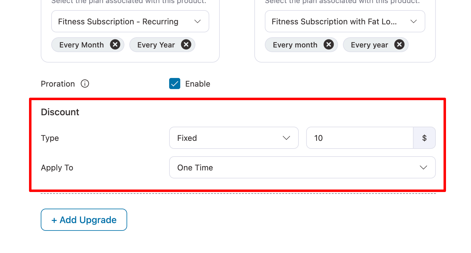
Note : You can click on +Add Upgrade to add more product upgrades here.
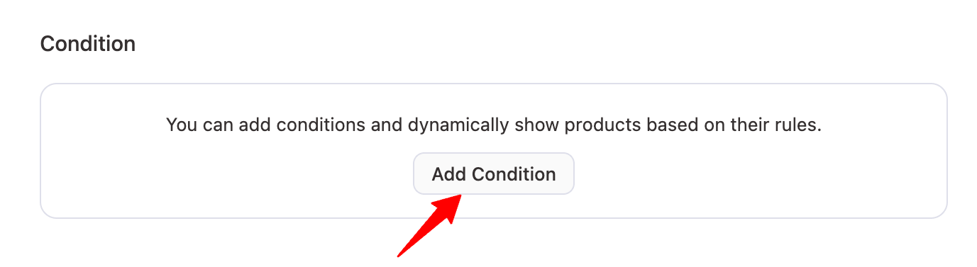
Step 5: Add conditions to show the upgrade group
Using the conditions feature, you can dynamically show products based on set rules.
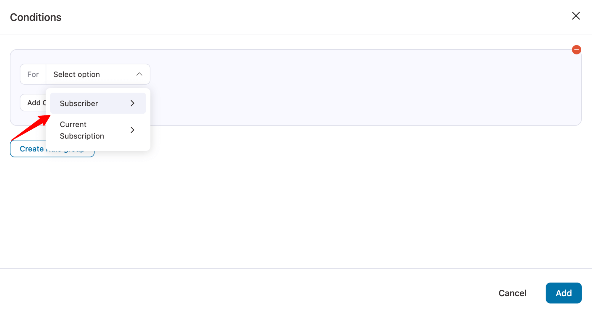
To set a rule, hit “Add Condition”.
Next, need to choose between two categories: Subscriber and Current Subscription.
Here are the values you get for each category:
| Subscriber | Current Subscription |
|---|---|
| Back | Is Active |
| Renewal Count | |
| First Name | Purchased Products |
| Last Name | Revenue |
| Joined Date | MRR |
| Joined Days | ARR |
| Has Active Subscription | Last Order Date |
| Renewal Count | Next Renewal Date |
| Active Count | Next Renewal Days |
| Purchased Products | |
| Active Subscription Product | |
| Revenue | |
| Inactive Count | |
| MRR | |
| ARR | |
| Last Order Date | |
| Next Renewal Date | |
| Next Renewal Days |
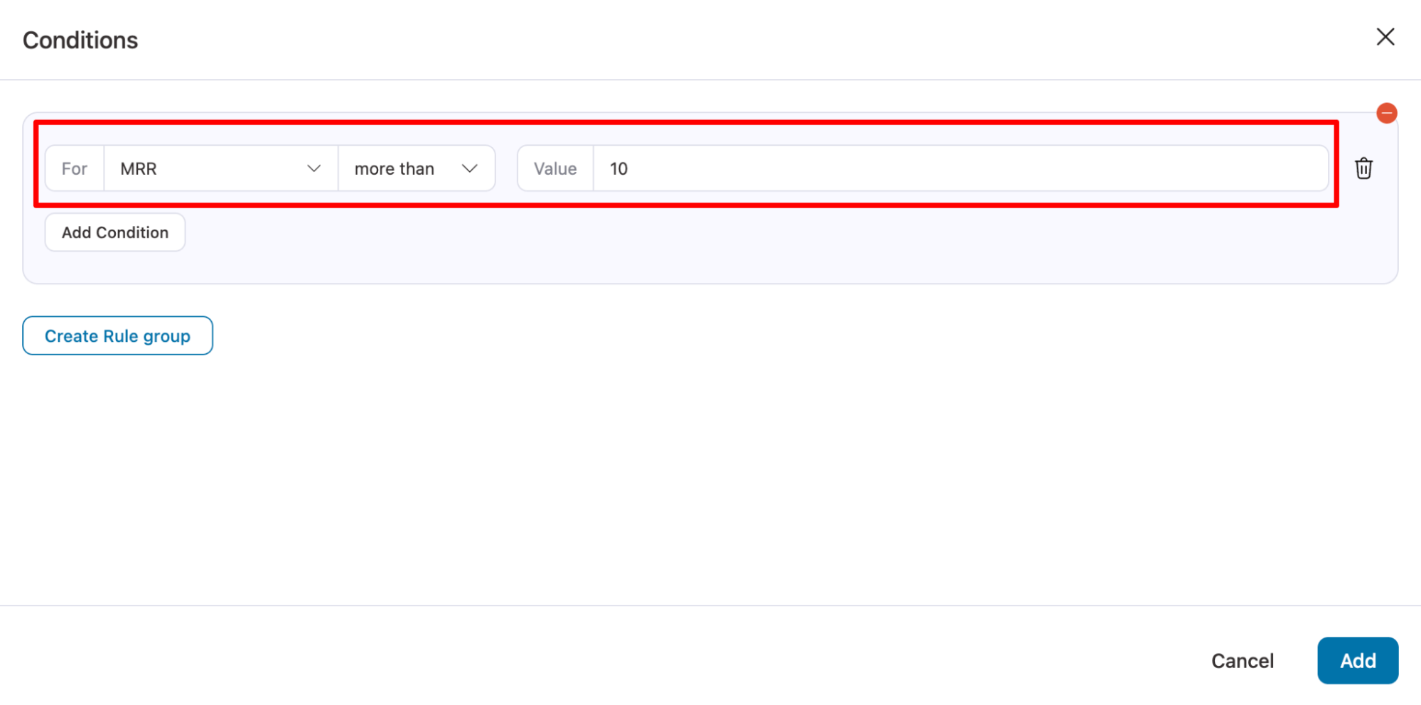
After selecting a value, set the Rule. For example, only show the upgrade if MRR is more than $10.
Note: You can add multiple conditions and also different rule groups.
Step 6: Configure Content and Design of the Upgrade Banner
Use a banner to catch customer attention and promote your upgrade offer.
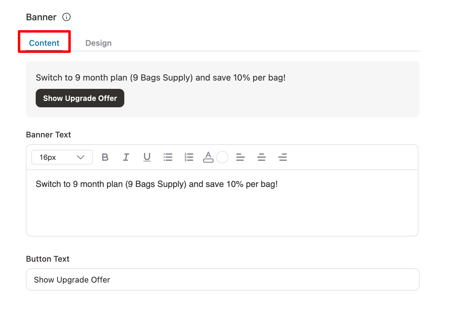
- Banner Text: Clearly communicate the value customers will get when upgrading. For example, “Switch to a 9-month plan (9 Bags Supply) and save 10% per bag!”
- Button Text: Add a strong call-to-action button that triggers the upgrade popup. For example, “Show Upgrade Offer”
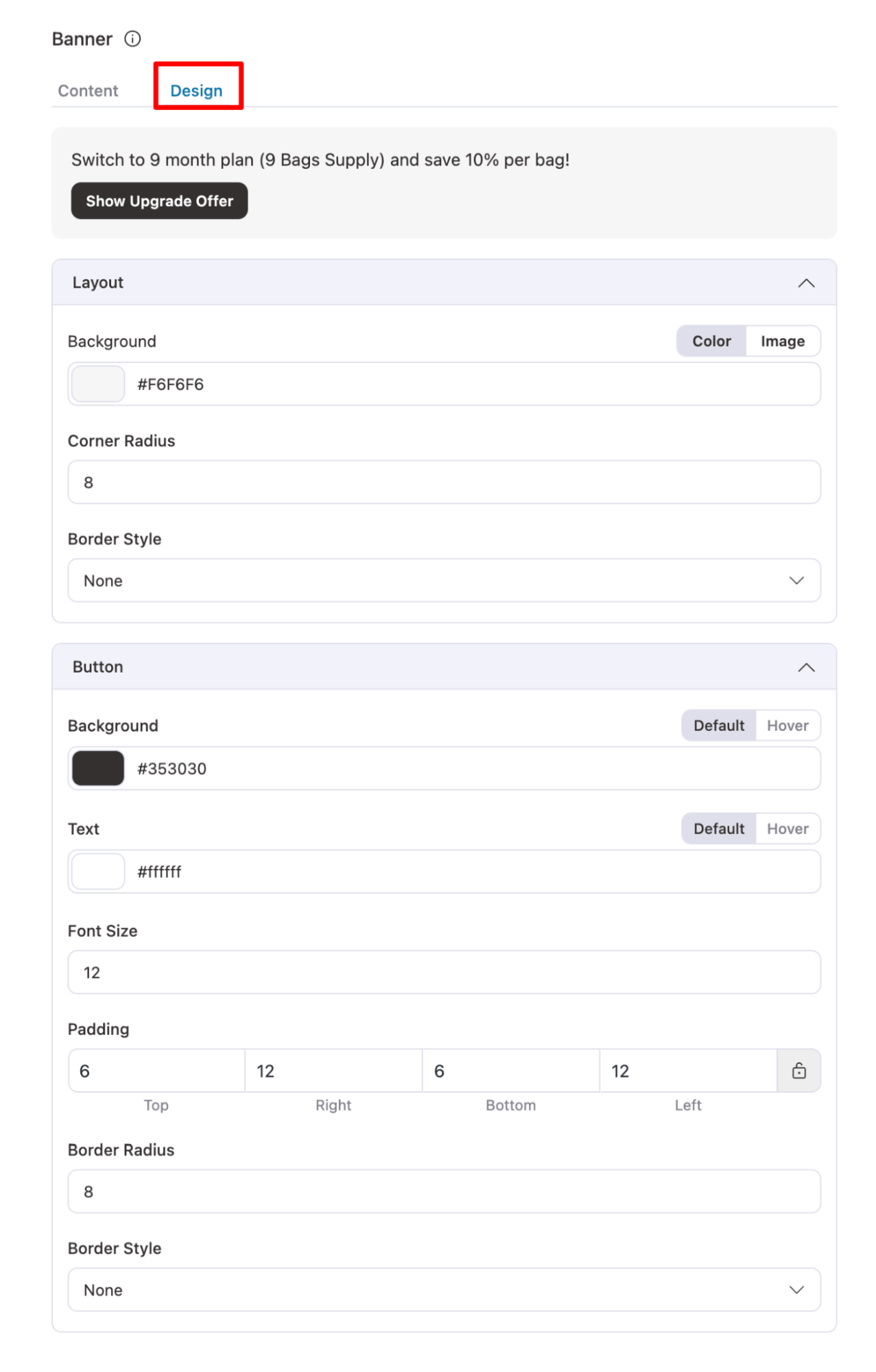
Move to the design tab to configure the layout and button design.
For Layout, set the following:
- Background – Set the background color for the offer block. Example: #F6F6F6
- Corner Radius – Round the edges of the offer block for a softer look. Example: 8px
- Border Style – Choose the border style for the offer block. Example: Button
For Button, set the following
- Background (Default) – Normal background color of the button. Example: Default
- Background (Hover) – Background color when the button is hovered. Example: #353030
- Text Color (Default) – Normal text color of the button. Example: Default
- Text Color (Hover) – Text color when the button is hovered. Example: #ffffff
- Font Size – Size of the text inside the button. Example: 12px
- Padding – Space inside the button around the text. Example: Top:12px, Right:6px, Bottom:12px, Left:6px
- Border Radius – Round the edges of the button. Example: 8px
- Border Style – Border style of the button. Example: Standard
- Optional Image – Add a visual image to highlight the offer. Example: Promotional image of the product or plan
Once done, save the changes.
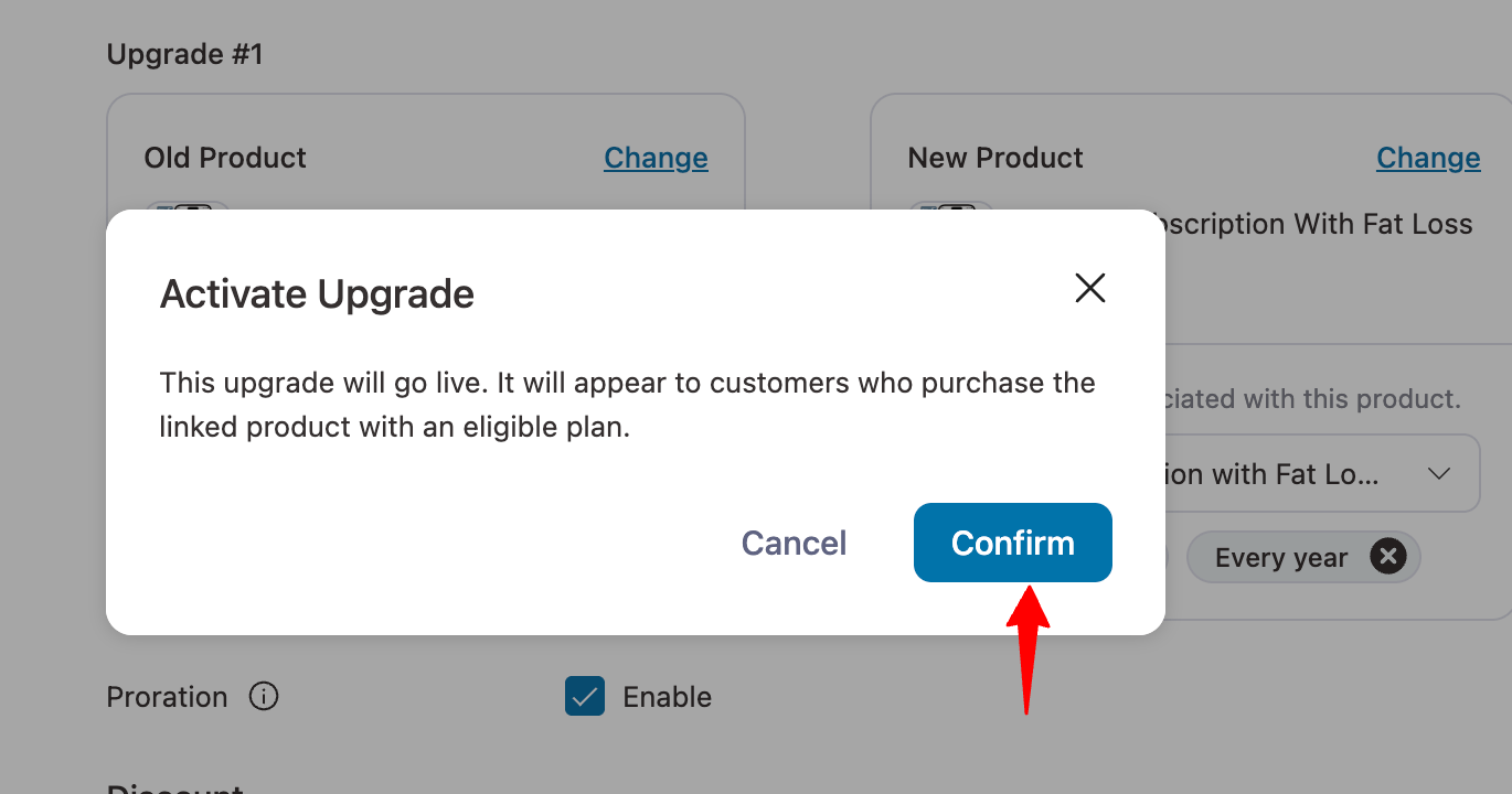
Step 7: Activate the upgrade group
Lastly, you need to set the upgrade group is Active. For this, select the status Active.
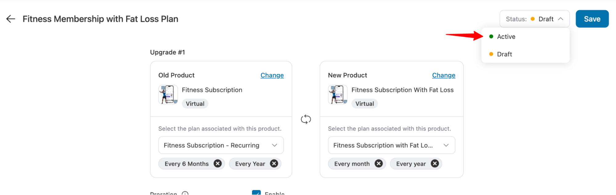
Make sure to “Confirm”.
